In collaboration with the Toledo Museum of Art, Bowling Green State University’s Art History department, and a team of talented graphic design students, More than War & Wine explored the complex themes of anxiety and relief in ancient cultures. This exhibit aimed to illuminate the emotional and psychological experiences of antiquity, offering a deeper understanding of how ancient civilizations addressed trauma, conflict, and the pursuit of relief through art, philosophy, and culture.
I worked alongside other design team members to help shape the visual materials that would effectively engage the public and highlight the exhibit’s unique perspective on ancient history. In addition to the promotional materials, the team developed patterns and colors to visually represent Roman, Egyptian, and Greek cultures, adding a deeper layer of meaning to the promotional materials
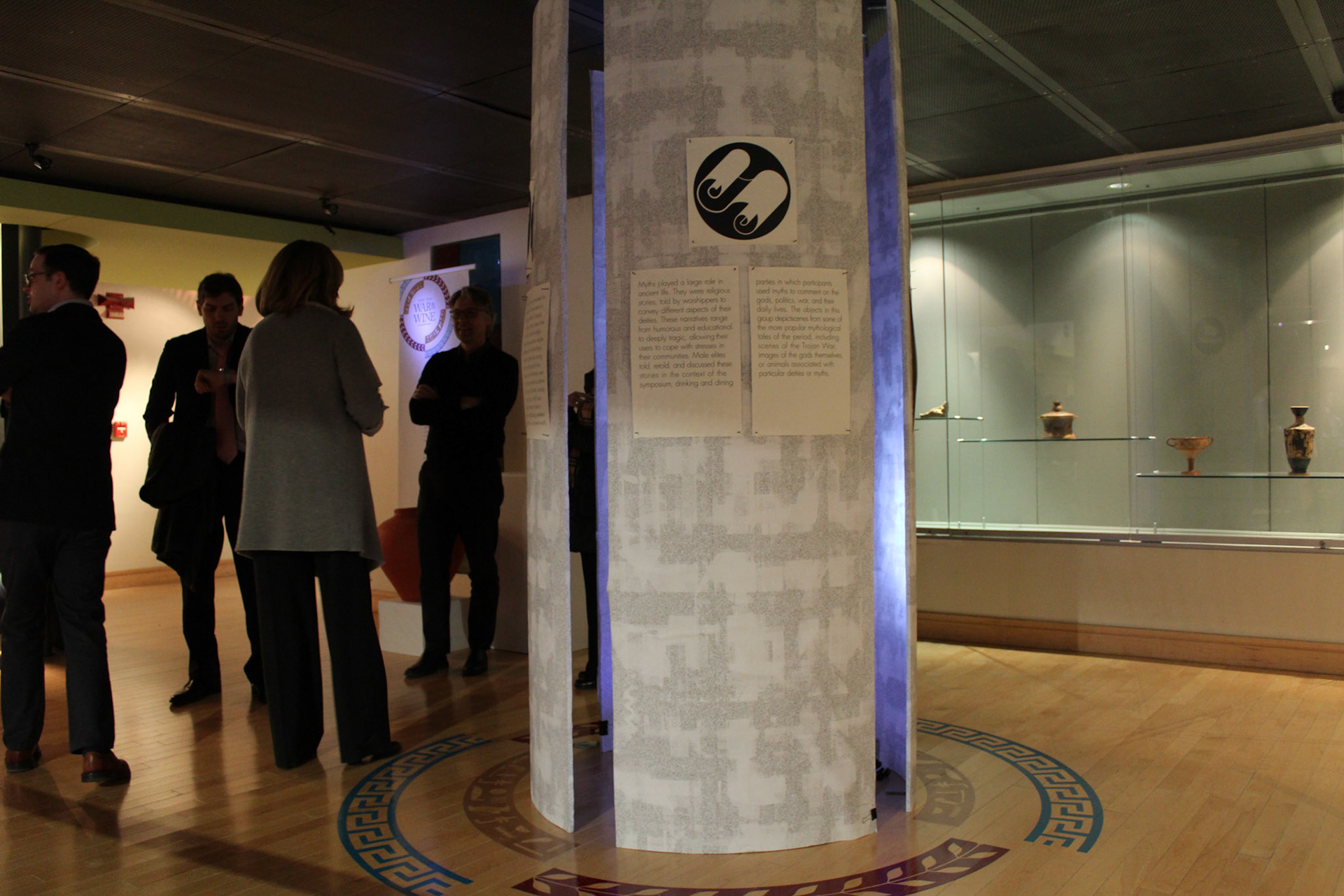
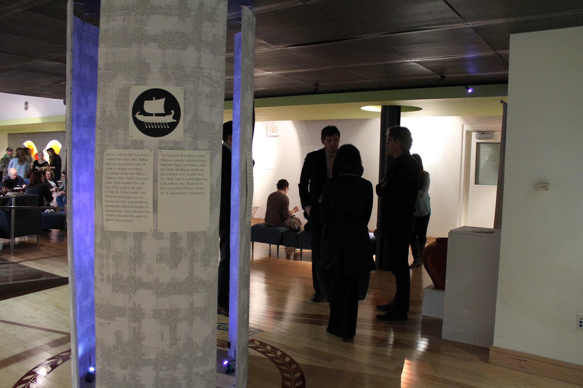
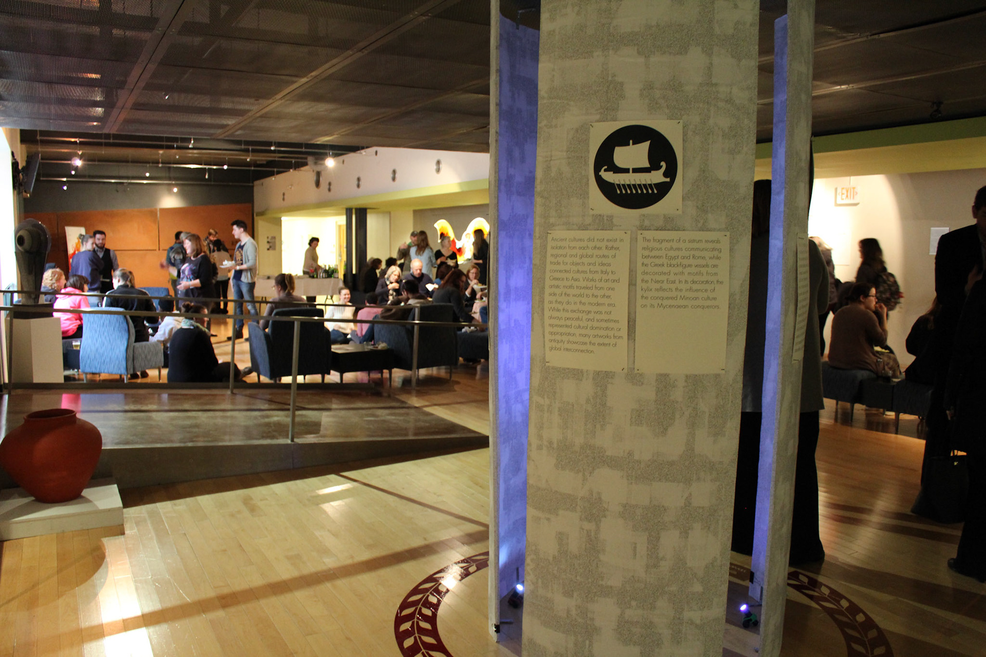
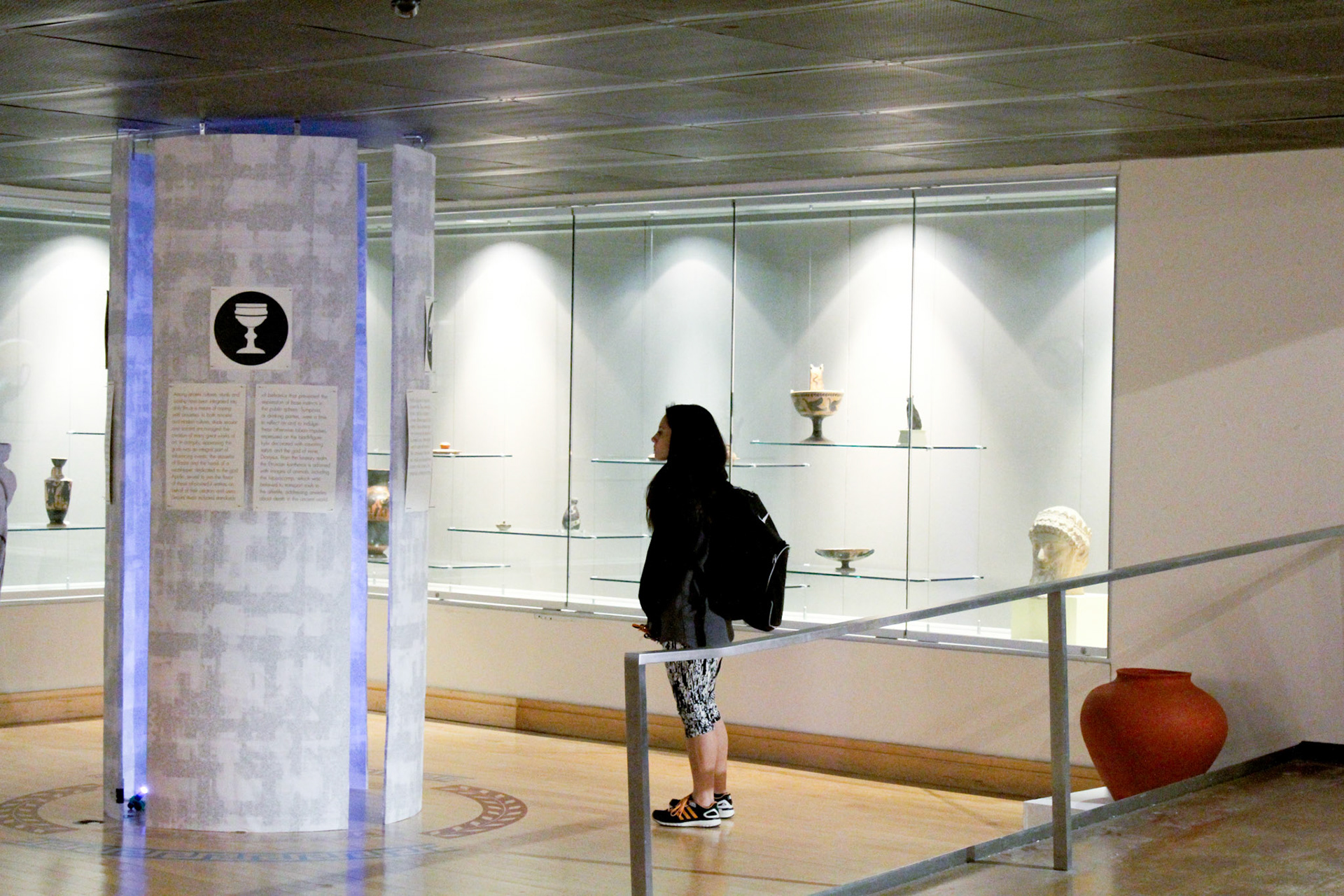
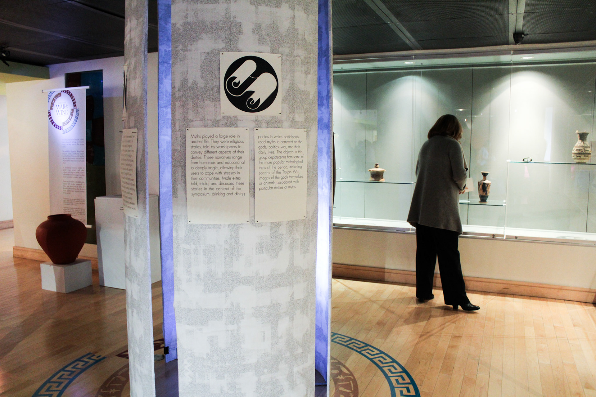
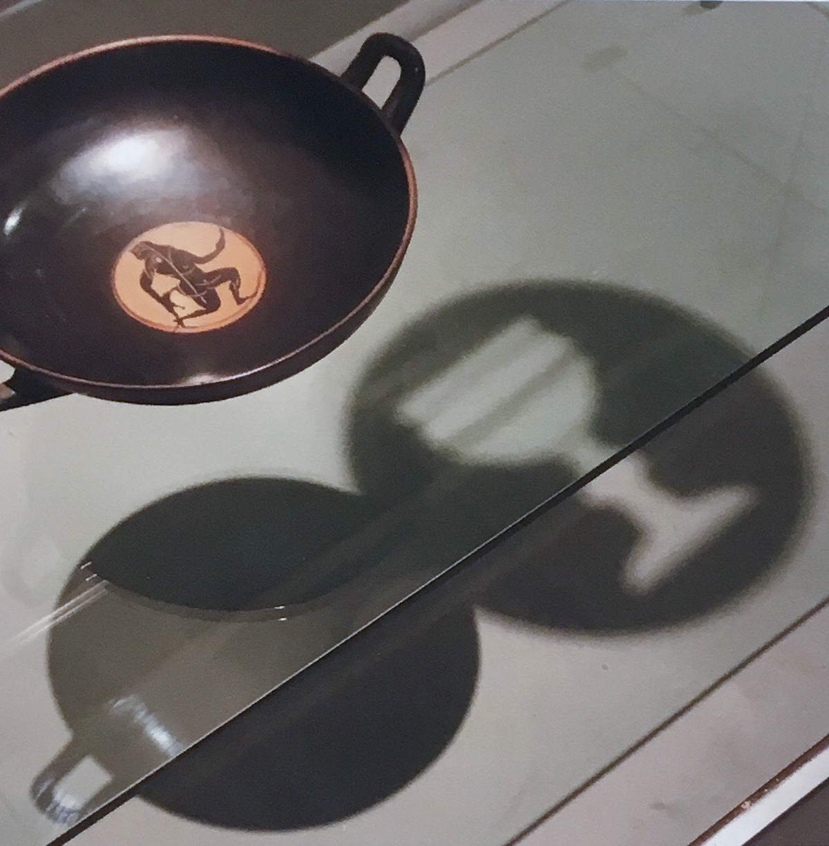
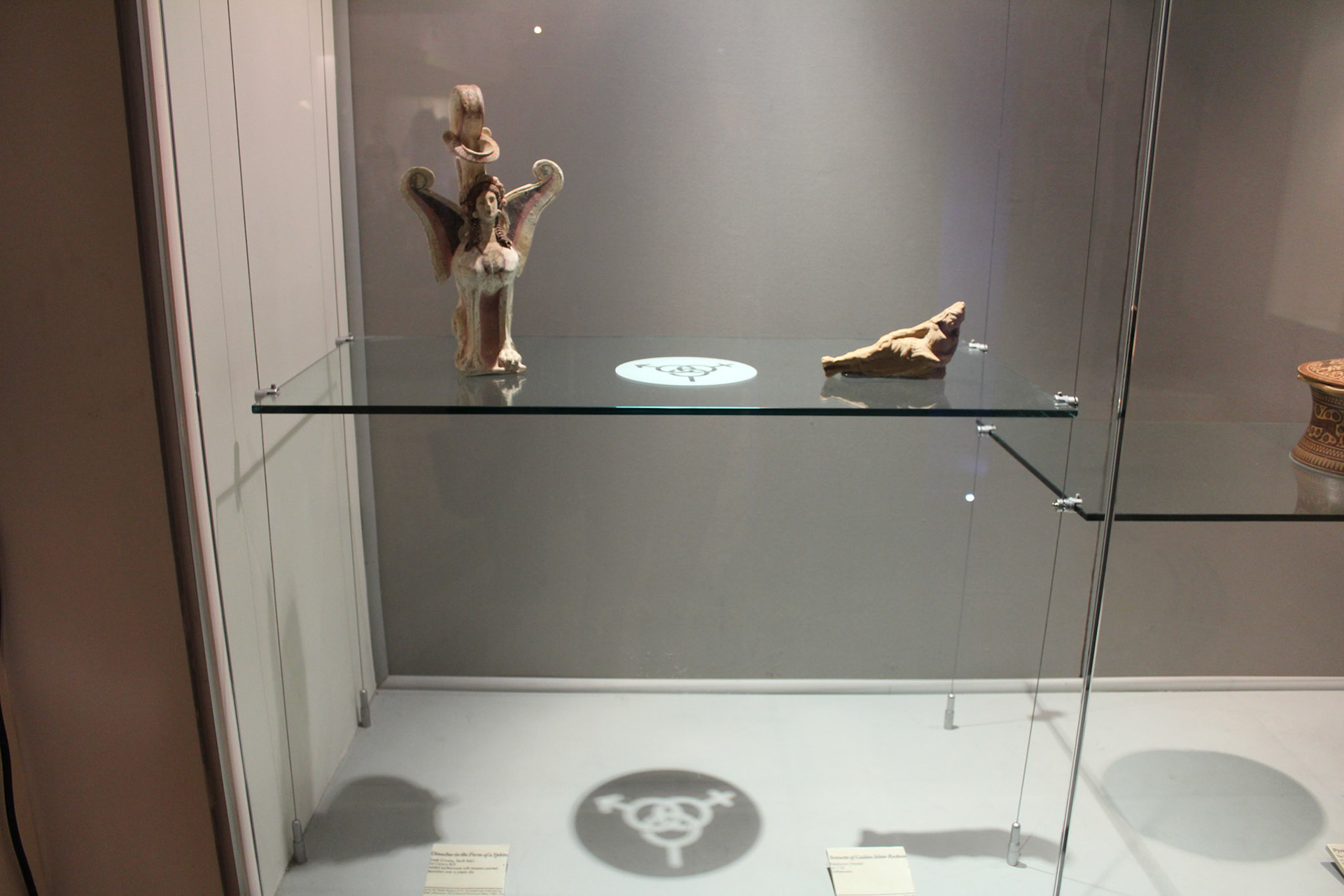
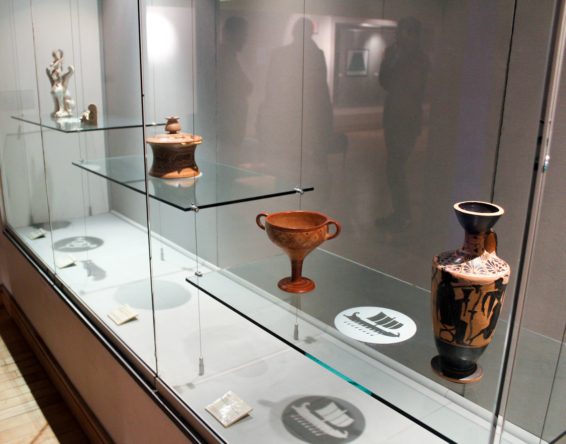
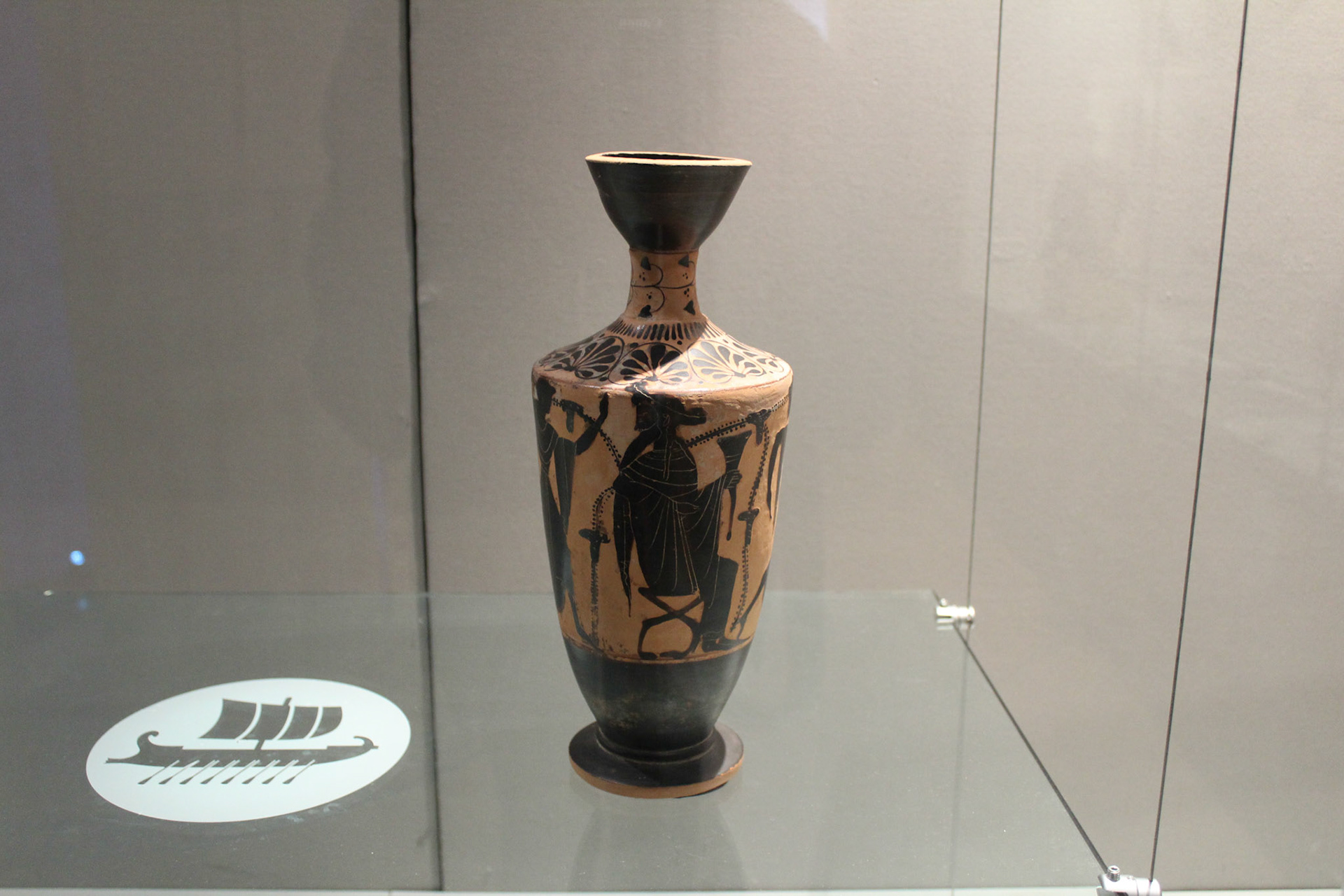
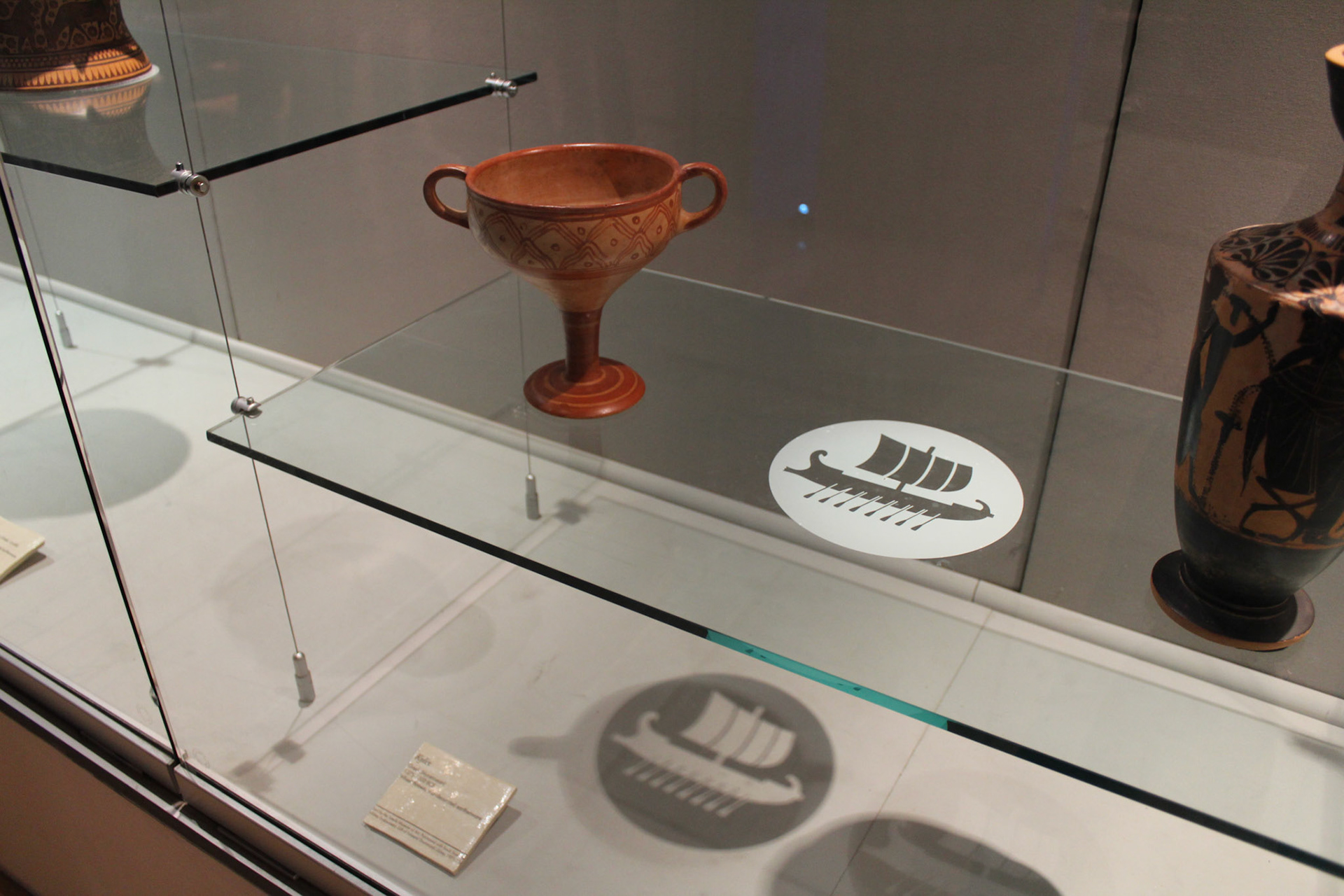
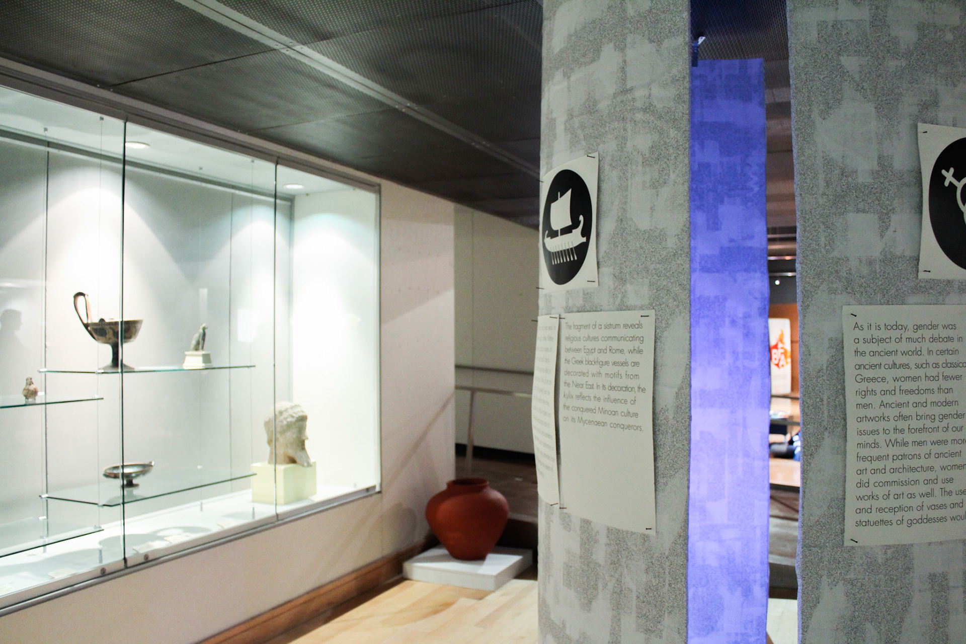
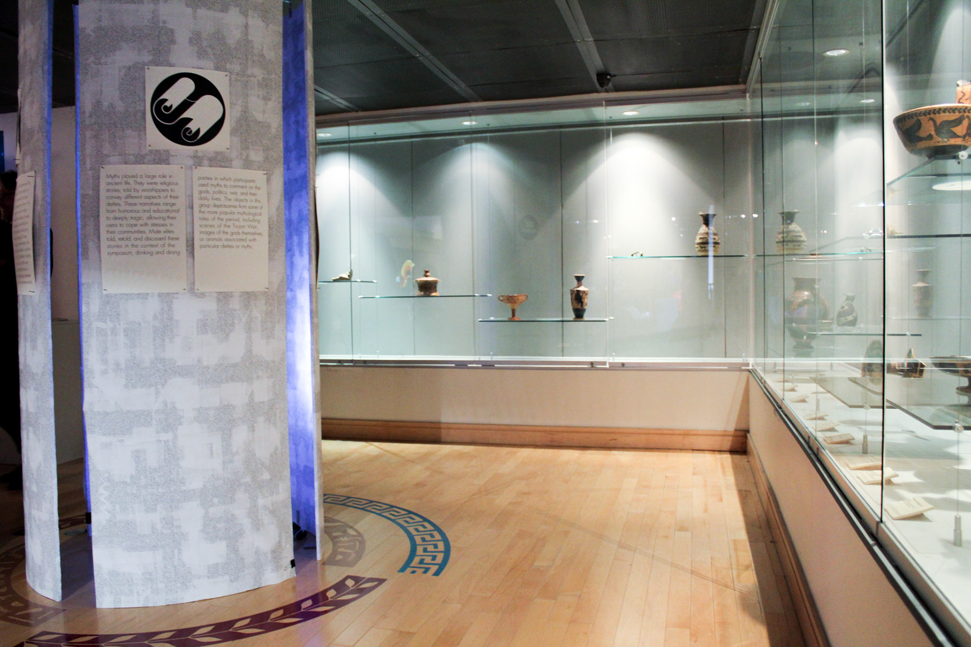
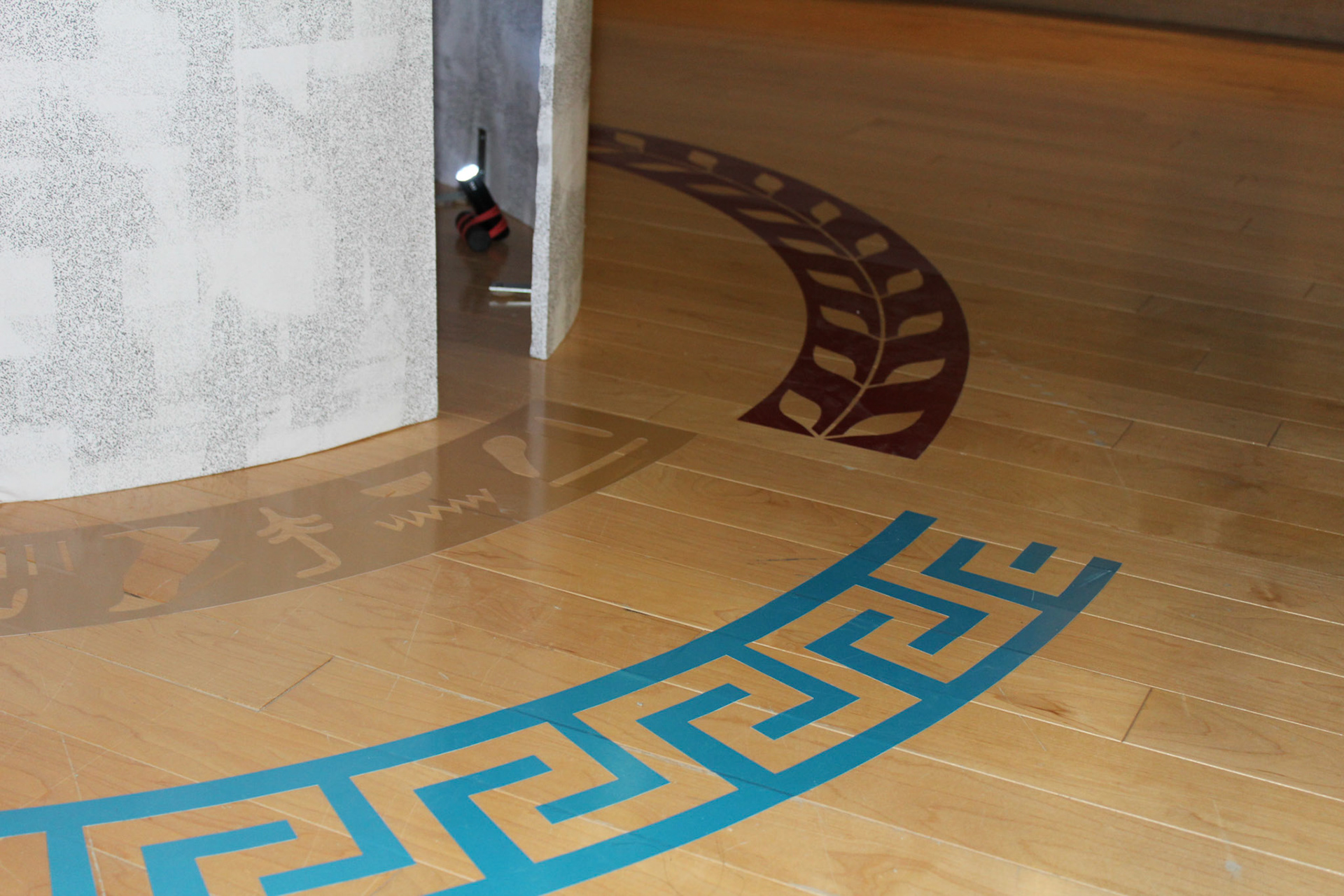
The graphic design team also designed a set of four icons to reflect the art history department’s organization of the exhibit into four categories representing sources of and responses to anxiety in ancient times. Vinyl cuts of these icons were placed near the ancient objects in the exhibit to help organize the space and guide visitors.
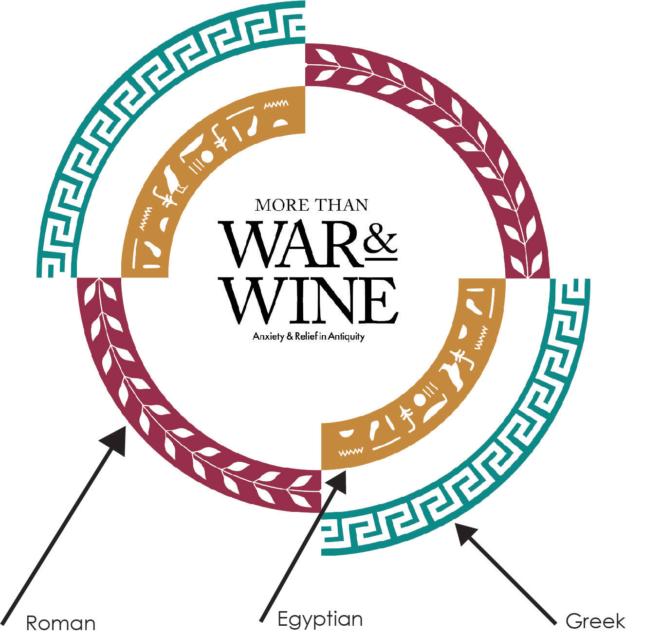
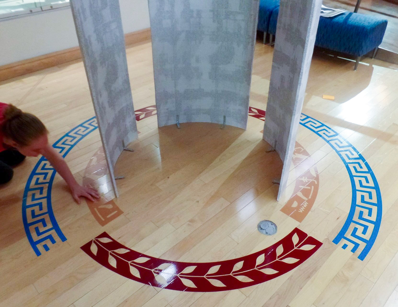

The art history department organized the objects into four categories that represented the sources for and responses to anxiety in ancient times. In response to this concept the graphic design team developed a set of four icons.
Vinyl cuts of the icons were placed near ancient objects to organize a space.
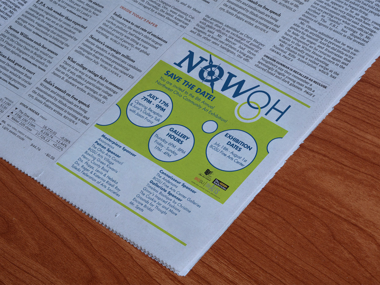
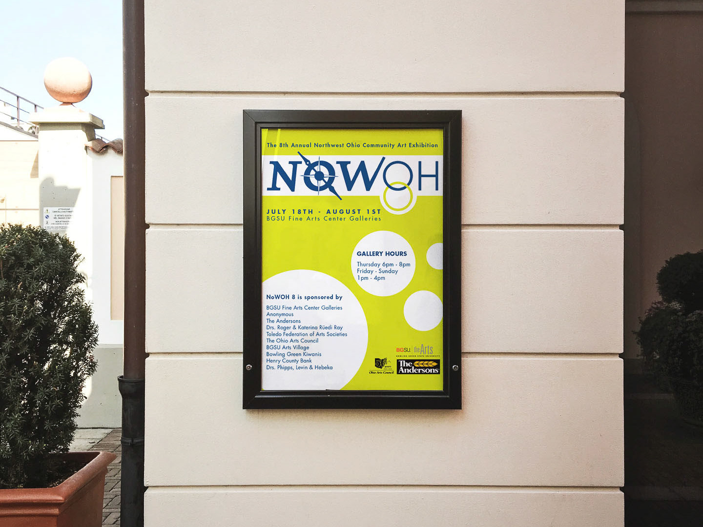
As my direct contribution, I developed the marketing strategy for the exhibit and led a small team of student designers in creating and executing the promotional materials necessary for advertising the exhibit. This included designing posters, banners, and digital content to support the exhibit’s themes.
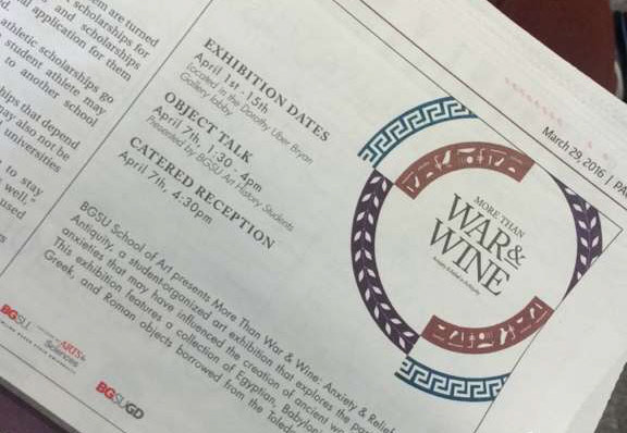
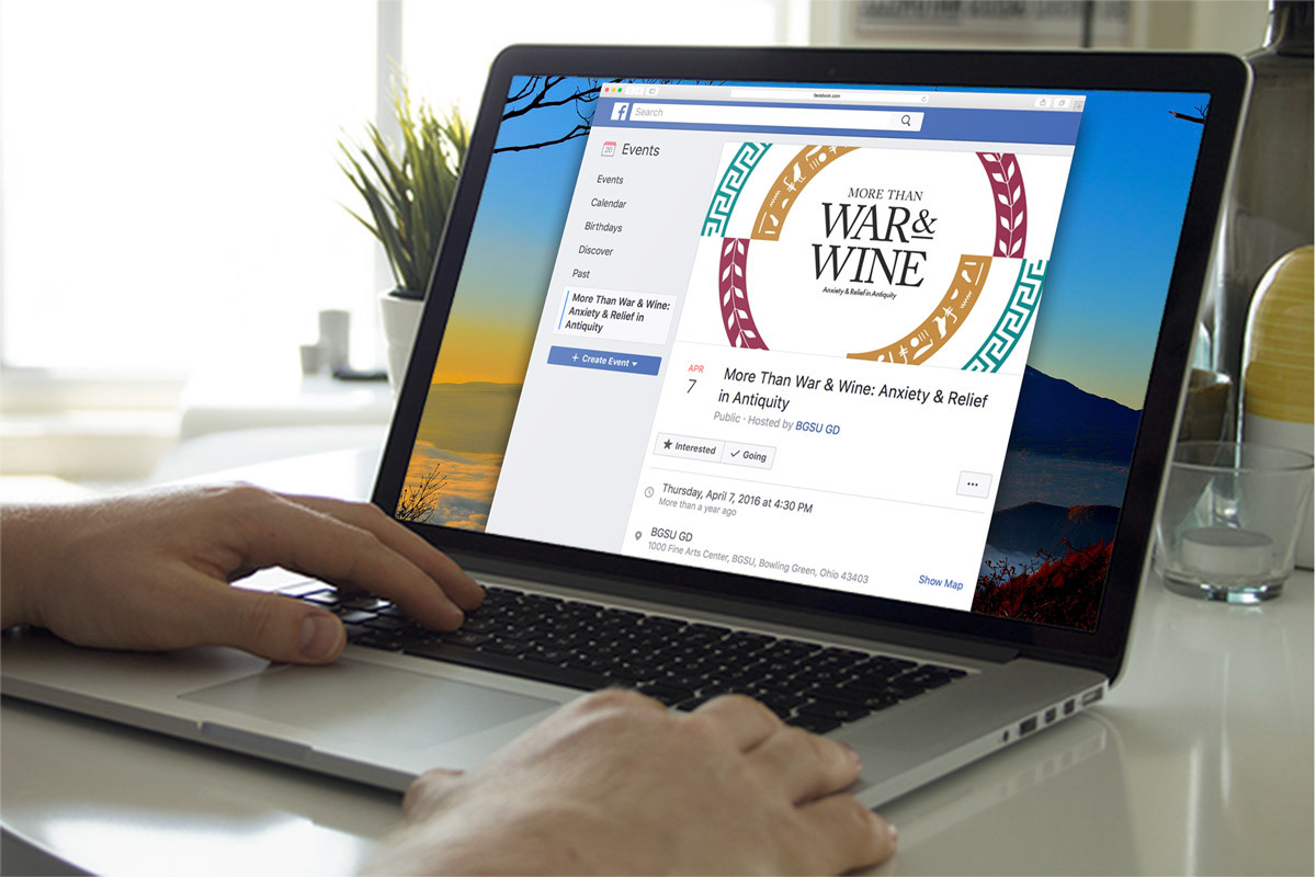
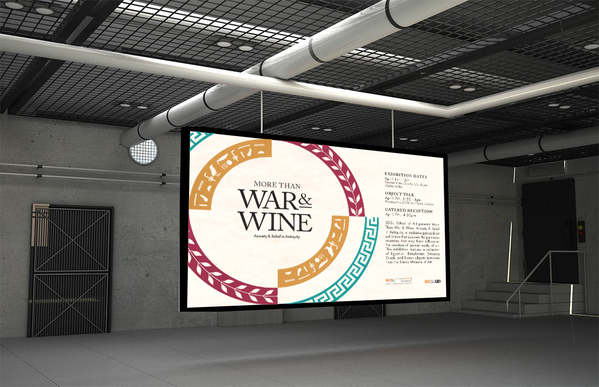
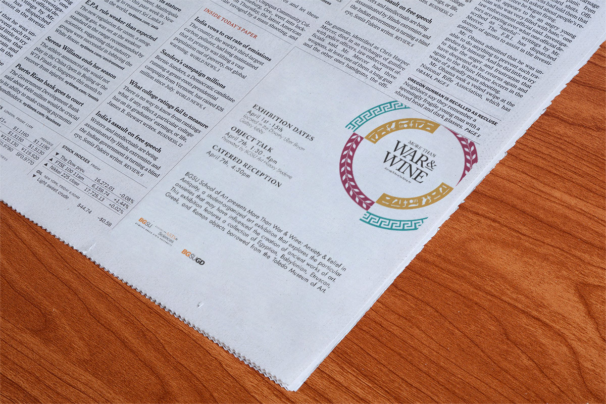
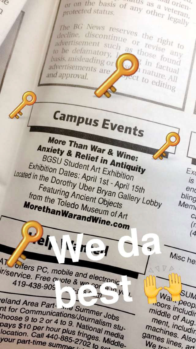
To boost outreach, I collaborated with Julie Carle, the communications manager for BGSU’s Office of Marketing and Communications, to distribute the marketing materials. We designed digital signs displayed on campus television screens, placed a print ad and classified marketing in the BGNews newspaper for the exhibition’s duration. I also created a Facebook event to promote the exhibit and encourage attendance at the opening reception, increasing visibility and engagement with the exhibit.
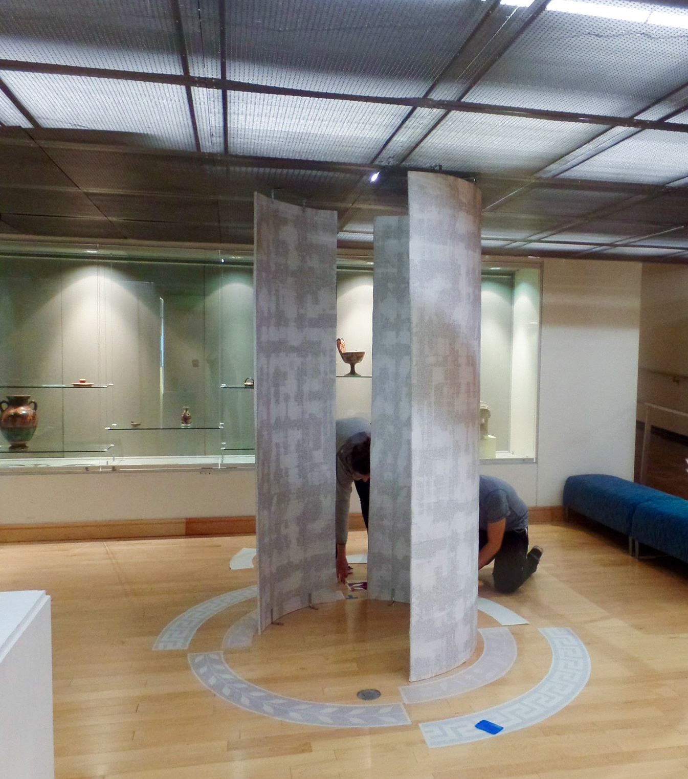
The project also presented significant challenges, particularly in planning, designing, and executing an exhibit that functionally displayed the objects in a coherent and organized manner. Given the exhibit’s modest budget and the need for quick disassembly, the design had to be both functional and adaptable.
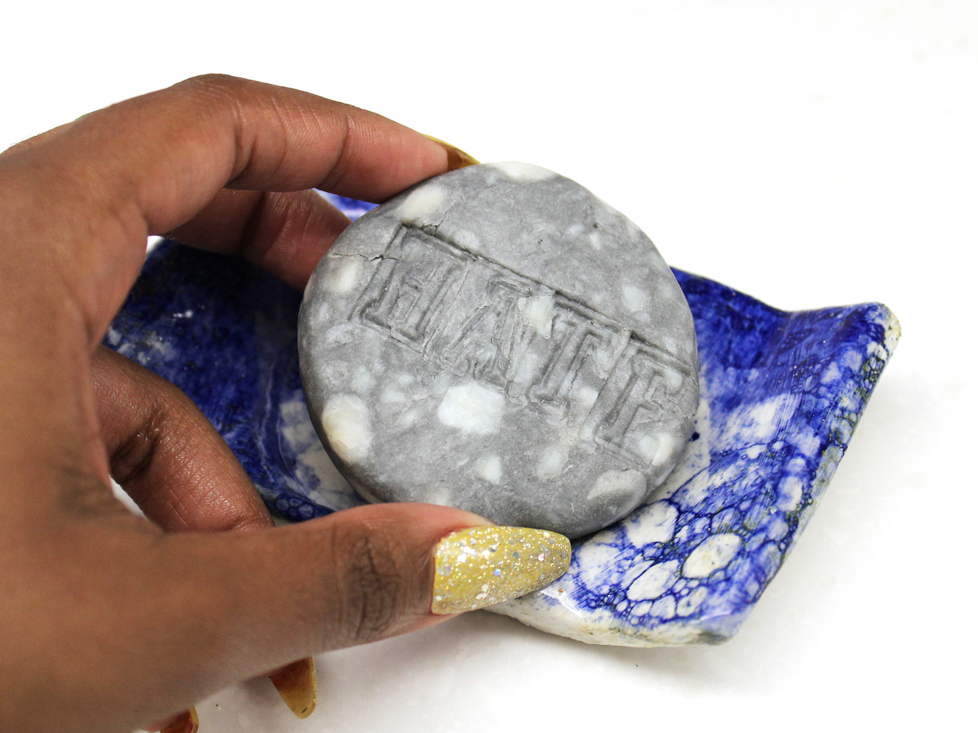
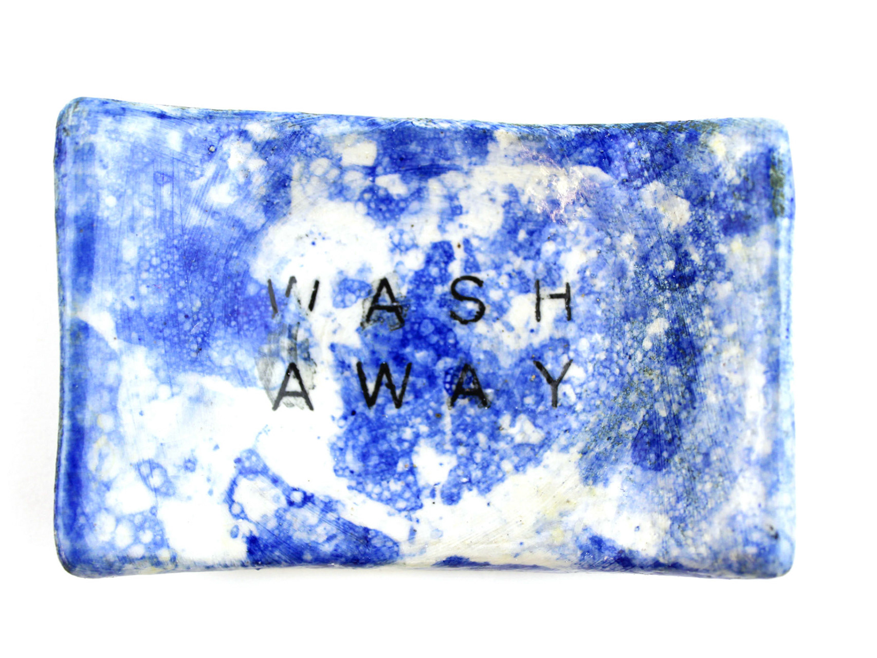
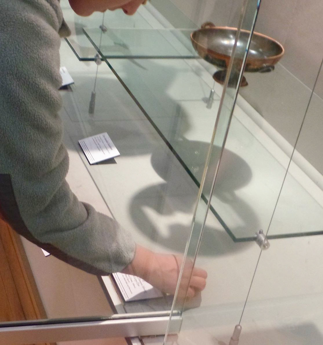
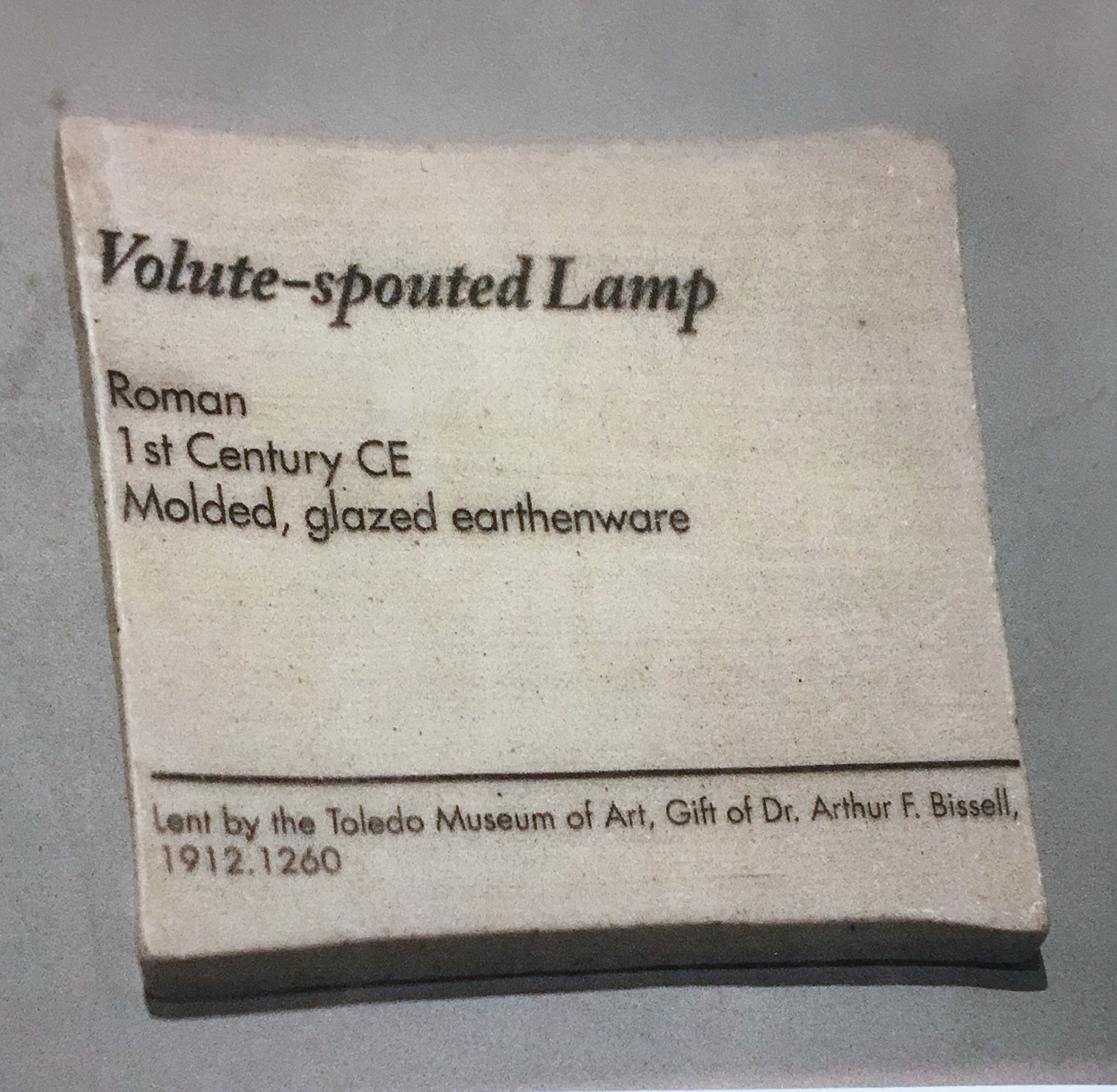
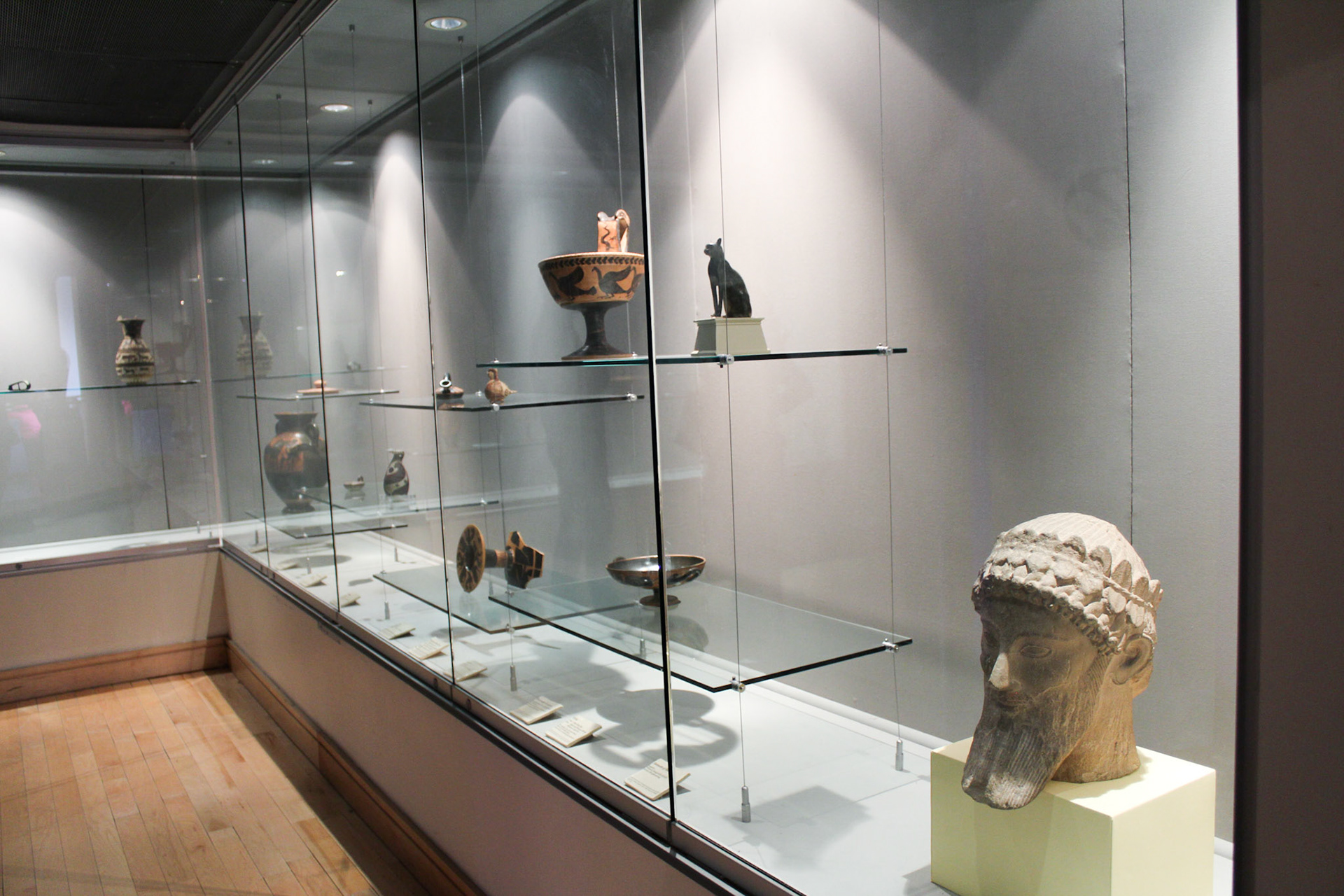
Equally important was ensuring that the three-dimensional design of the exhibit’s environment created a metaphoric context for the ancient objects, which ranged from 1100 B.C.E to 400 C.E., making sure the space felt appropriate and evocative of the time periods represented. The ceramic labels were made for these objects at a size of 4” x 4”.
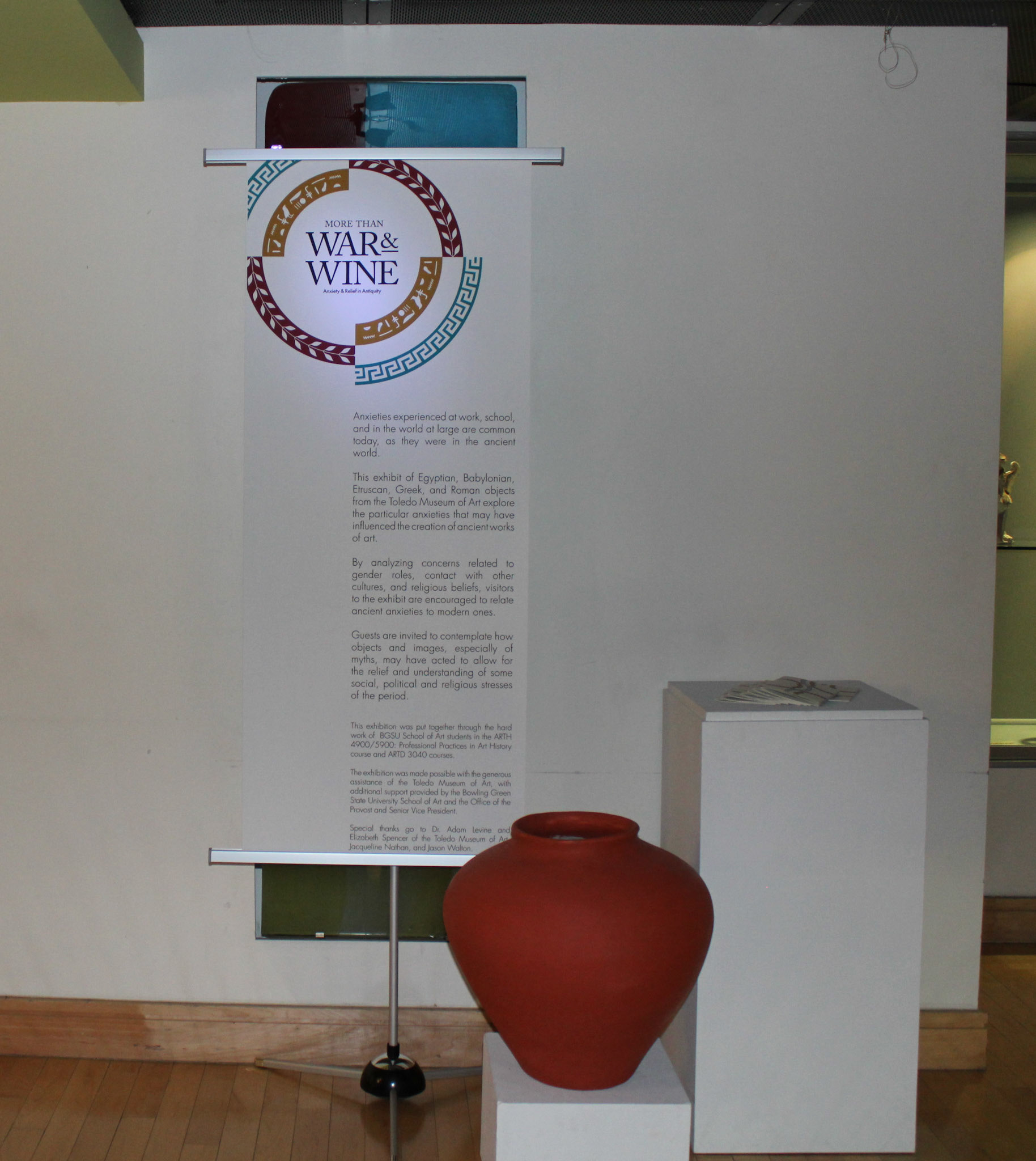
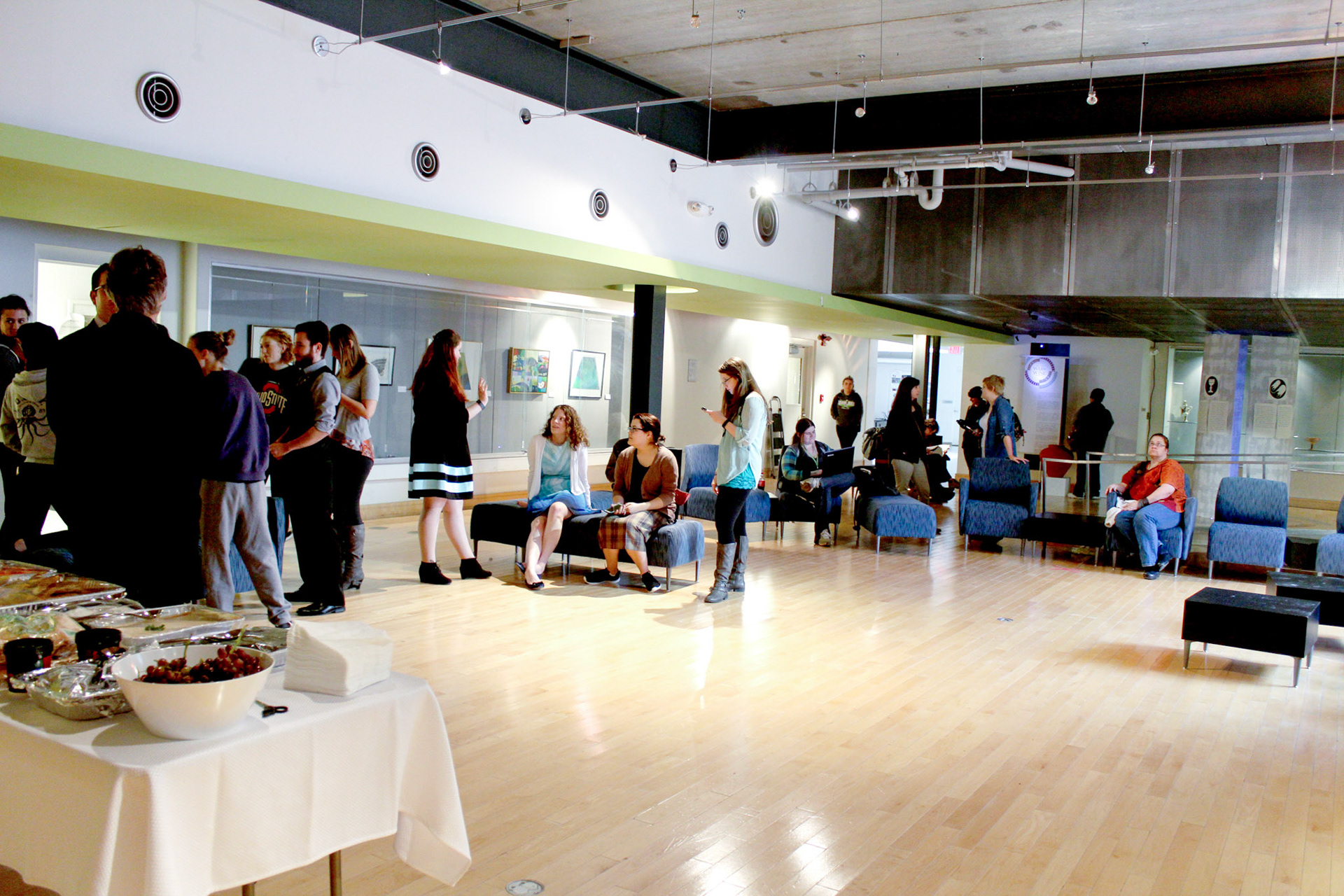
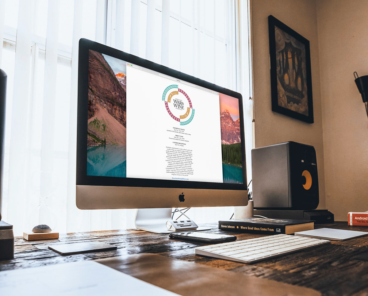
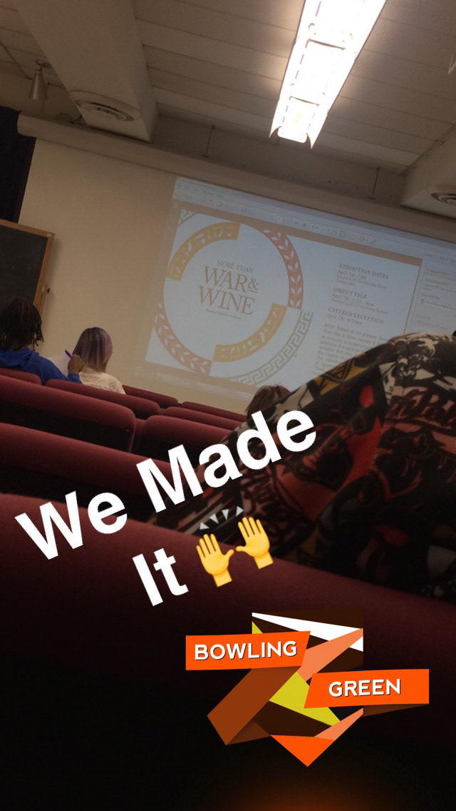
Additionally, I coordinated the catering for the opening reception, ensuring that the event ran smoothly and provided a welcoming environment for attendees. More than War & Wine was on display from April 1st — 15th, 2016, in the lobby outside the Dorothy Uber Bryan Gallery.